Anna Shalomova
PPM Consultant
Data is everywhere, and we at FluentPro are handing you a powerful tool that enables you to visualize it the way you want. No more countless hours with development teams, infinite design and review meetings, and weeks or months of waiting for the dashboards and reports you need.
You are now in full control – and all that you need is 10 minutes of your time to build a dashboard just the way you need it to be.
EPM Pulse + Office 365 Planner Come Together
For Office 365 Planner users, EPM Pulse offers self-service data visualization, dashboard design, and reporting capabilities. With EPM Pulse, users can build portfolio and project dashboards along with reports for Office 365 Planner in a matter of seconds, using over 30 prebuilt charts that display real-time project information, drill down to details and allow sharing of dashboards with others. And significantly, users can instantly adjust dashboards to address changing requirements without waiting for IT or report developers.
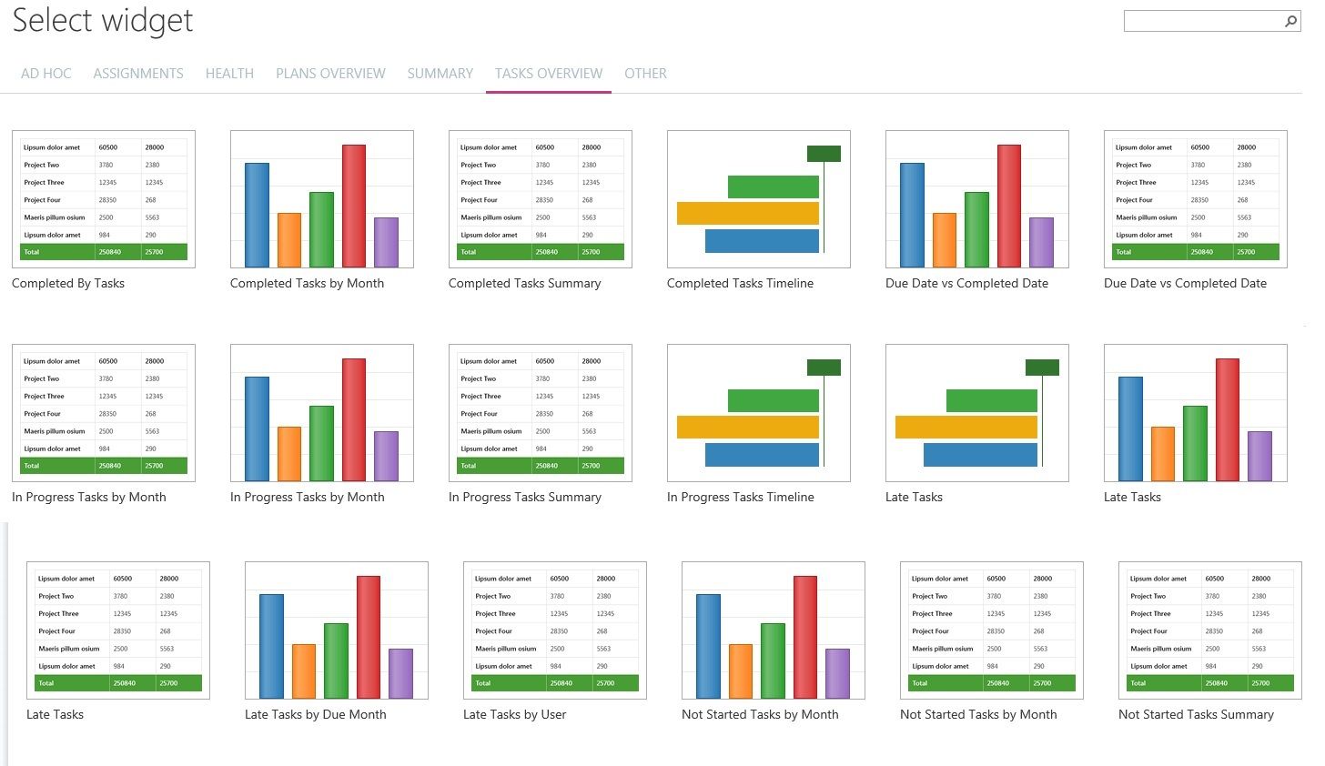
Here are some of the kinds of data charts supported by EPM Pulse:
- Portfolio roadmap
- Project analysis
- Executive summary
- PMO overview
- Team overview
- Resource dashboard
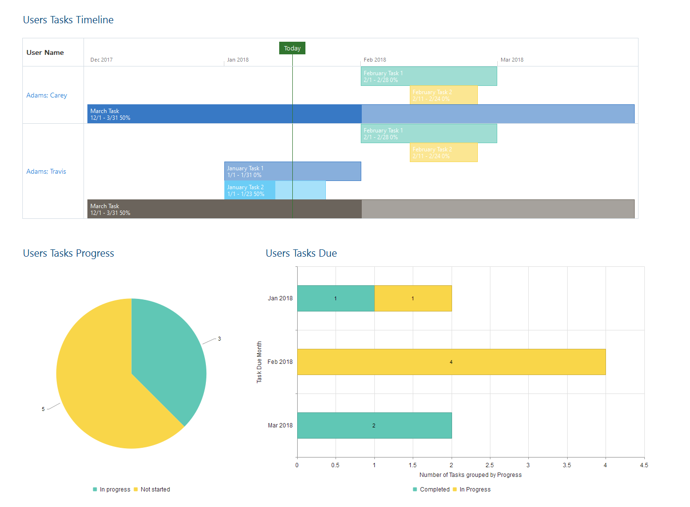
EPM Pulse is the ultimate tool to help users with Dashboards in Office 365 Planner, visualize portfolio analysis information and scenarios using 30 widgets. Use its power to build and update project or portfolio dashboards quickly and easily!
Get help with dashboards
by scheduling a free consultation with FluentPro Team


