
Anna Shalomova
PPM Consultant
To create understandable reports and update them in real time, modern businesses need an effective service for information processing. Power BI is quite a multifunctional tool, so it’s hard to describe all its functionality in one article. We’ve decided to provide answers to basic questions about working with Power BI reports, for example:
- How to load the necessary data set into the program (for example, integration with Google Analytics and data from MySQL).
- How to organize the data to bring it to the desired form for visualization.
- How to build a report with data from different sources.
- How to set up data filters, select suitable visualization elements, and publish the result for viewing in the online version of Power BI.
A brief overview of Microsoft Power BI features
Power BI is a powerful platform. You can use these versions of the program:
- Power BI Desktop is designed to develop data models and reports;
- Power BI Service is an online analog specializing in monitoring and analyzing ready-made reports (so the possibilities of designing and working with data there are limited).
As a rule, the Desktop version is used as a constructor, after which the developed file is published to the Power BI Service.
Power BI has many built-in connectors that can intertwine reports in minutes to build consolidated reports and charts. Available connectors include, but are not limited to: Excel; CSV; SQL Server; Oracle; MySQL; Microsoft Azure SQL Database; Blob storage; SharePoint list; Microsoft Exchange; Dynamics CRM Online; Facebook; Google Analytics; Salesforce objects and reports; Github; MailChimp; QuickBooks Online; Smartsheets; Stripe and Empty request. In a word, you can import data from the best-known databases and services.
After downloading information from available sources in Power BI, you can “clean” and transform this data. The tables can be edited, and based on their columns, you can convert arrays of information into data sets with the structure necessary to build the visualization.
Having formed a dataset, you will see a lot of built-in visualization tools including, but not limited to stacked, grouped, and normalized bar chart; stacked, grouped, linear, and normalized histograms; schedule; simple and stacked area chart; waterfall chart; scatter plot; pie chart; tree diagram; map; table; matrix and funnel. All the elements have settings that allow the change of color, background, name, borders, etc. You can always upload custom visuals if you don’t enjoy the standard set.
How do you upload data to Power BI Desktop? Google Analytics example
Downloading information from the Google Analytics view requires clicking the “Receive Data” button on the “Home” tab in the “External Data” group. Select the “Google Analytics” service in the “Get Data” dialog box in the “Other” group and click “Connect.” Get the data; next, Power BI will request a login to your Google account. Sign in to your Google Account and select your account. The final step is to grant permission to view the data in the desired Google Analytics view. After clicking the “Allow” button, we automatically return to the “Google Account” window, where you will be notified that you are logged in. Click the “Connection” button. You will see a list of all available accounts, resources, and Google Analytics views in the “Navigator” window. Each view has the same set of parameters and indicators, divided into 28 groups.
Groups:
- Ad Exchange – information about the effectiveness of advertising in Ad Exchange;
- AdSense – AdSense ad performance information;
- AdWords – information about the effectiveness of advertising campaigns in Google Ads;
- App tracing – information about interaction with the mobile application;
- Audience – demographic information about site visitors;
- Channel grouping – groups of traffic channels;
- Content Experiments – information about the experiments;
- Content Grouping – classification of site content into groups;
- Custom variables or columns – custom parameters and indicators;
- Google Marketing Platform – performance information in the Google, Advertising Manager;
- E-commerce – e-commerce data;
- Event tracking – information about events;
- Exceptions – exceptions;
- Geo network – visitors’ geodata;
- Goal conversion – data on the achievement of goals;
- Internal Search – information on the use of search on the site;
- Page Tracking – information about the pages that users viewed;
- Platform or device – operating systems and user devices;
- Related product-related services;
- Information about the session;
- Site speed – page loading speed;
- Social activities – indicators of activity in social networks;
- Social interaction – indicators of the interaction of traffic from social networks;
- System – information about the system indicators of visitors;
- Time – information about the time of the events;
- Traffic source – information about traffic sources;
- User – information about users;
- User timings – the duration of the session.
To load the selected data into the Power BI data model, click the “Load” button, which is located in the lower right corner of the “Navigator” window. Load the selected items into the data model. Now, the loaded dataset is displayed in the field area, and we can build any available visual element based on this information.
Note: With Power BI reports, as with any API request in Google Analytics, there is a limit on the maximum number of requested parameters (no more than seven) and indicators (no more than ten).
How do you upload data to Power BI Desktop? MySQL example
Use the “Get Data” command, which is located on the “Home” tab, to download data from MySQL. In the “Get Data” dialog box in the “Database” group, select the “MySQL Database” item. After clicking on the “Connect” button in the “MySQL Database,” enter the server IP, database name, and SQL query text. If you are unfamiliar with SQL and want to select some tables from the entire database, then you should not enter an SQL query; in the next step, you can choose a table. If you wish to download the data from the local PC, enter “localhost” in the “Server” field instead of an IP.
Next, enter the credentials for access to MySQL and click the “Connect” button. At this stage, the connection to the MySQL server is established. If you have previously registered an SQL script, then the result of its work will be loaded into the data model. Since we did not specify the query in this instance, the list of available tables from the previously specified database will appear in the left part of the “Navigator” dialog box.
Note: Following these instructions, you can connect any available database and all the downloaded information into one table or chart.
How to sort the data and establish relationships between datasets and tables
After all the necessary data is loaded, you must bring it to the desired form. The most convenient way to edit information is to switch to the “Data” mode using the same-name command located in the left pane of the Power BI working window. You can change the type of data stored in any column, create new columns and measures using the capabilities of the DAX formula language, and replace values stored in columns—generally, do whatever you consider necessary with the data.
It is necessary to configure relationships between the datasets to establish relationships between tables or build a visualization based on data from two different sources. Power BI supports three types of relationships:
- many to one;
- one to one;
- one to
The only connection type suitable for tables loaded as an example is “many to many.” It is created through intermediate tables (directories) using two types of connections: many-to-one and one-to-many. There are three parameters in our dataset, according to which it is necessary to configure relationships between the tables “Default Channel Group,” “Year Month,” and “User Type.” Accordingly, it is required to create three similar reference books containing a list of each category’s unique elements. For example, we will upload a list of unique elements for each field from CSV files.
- Channel Group;
- Year Month;
- User Type.
Streamlining CSV Integration: Uploading Data to Power BI
The process of uploading CSV files to Power BI is as simple as the previously described connections to Google Analytics and MySQL: click on the “Receive data” button; in the “File” group, select “CSV” and load three downloaded CSV files into the data model. When loading the “Channel Group” and “User Type” tables, you must specify that the first row is a column header. To do this, go to the query editing mode; on the “Conversion” tab in the “Table” drop-down menu, use the “Use the first row as header” command. If you have done everything correctly, the data model will consist of five tables.
To verify this, you can go to the visual interface to view the data model (to do this, click the icon with the image of the relationships between the tables in the left panel of Power BI). To create all links further, we need to change the type of current links to unidirectional ones. Otherwise, the links we plan to make will be ambiguous, and Power BI will generate an error when they are defined. To change the type of links, double-click on the connection with the left mouse button, and in the “Change Link” dialog box, change the direction of cross-filtering to unidirectional.
How to build a visualization
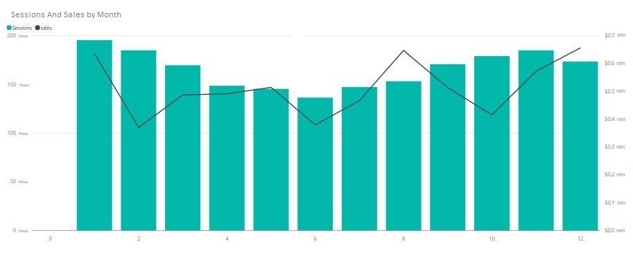
To create a visualization, return to the “Report” mode using the same name button in the menu on the left side of the Power BI window. Next, we will build a chart of earlier acquired data from different sources (As an element of visualization, we will use the view “Linear histogram and accumulated histogram.”). Drag the “month” field from the “Year Month” table to the “Shared axis” area; drag the “Session” field from the “Data from GA” table into the “Values of columns” area; drag the “sales” field from the “Data from MySQL” table to the “Row Values” area.
As a result of these manipulations, a chart of the following type will be constructed in the report are:
Additionally, you can use the options for formatting visualization objects by clicking on the brush icon. Formatting options for visualization objects.
Note: you can change the colors, size, font, background, and other parameters of the visualization element.
How to configure data filters
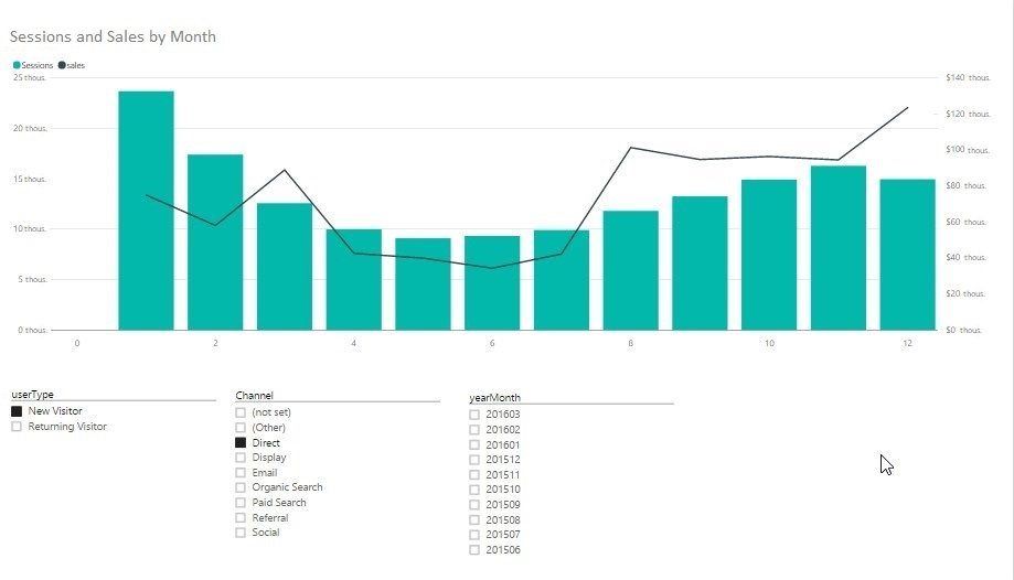
You should add three slices to the worksheet for more convenient work with data filters. To do this, drag and drop the following fields into the empty area of the report are:
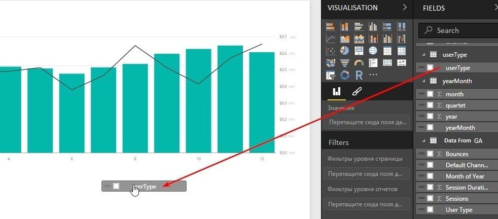
- “User Type” from the same table; “User Type” from the same table;
- “Year Month” from the “Year Month” table;
- “Channel” from the “channel” table, respectively.
Then, select each of these objects with the mouse and switch to the “Slice” mode. The “Slice” mod. As a result, we get a sheet that can filter data by user type, source/channel, and month of the year.
If you need to change the Google account to which particular Analytics views are attached, use the menu: File -> Options and Settings -> Data Source Settings. Change the Google Account. Next, you can change the settings or delete any connected data source.

Note: Experiment with the visualization elements and choose the most suitable, then update all the charts and tables with a single button.
How to work with Power BI reports
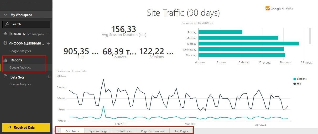
You can also view all the reports generated automatically. To do this, click on the “Analytics” item in the main menu in the report area. Power BI reports are grouped by page:
- Site traffic;
- System usage;
- Total users;
- Page performance;
- Top pages.
The Site Traffic page contains information about sessions and hits, as well as behavioral indicators of users.
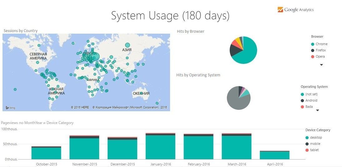
The System Usage page contains geolocation, operating system, and device type of users.
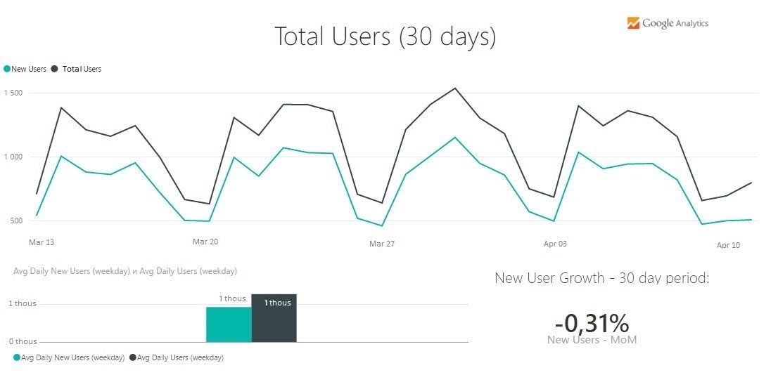
On the Total User page, you will find information about the number of visitors.
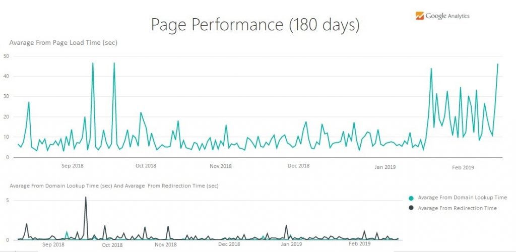
The Page Performance page contains information about the page loading speed.
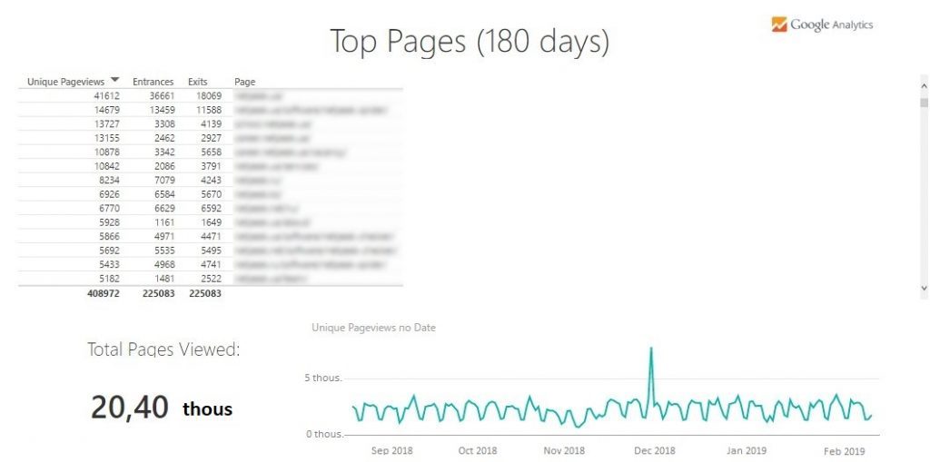
The last Top Pages page displays information about the number of unique views and the number of entries and exits from the site by page.
You can change any report element or add a new page; to do this, click on the “Edit Report” button. At the bottom of the screen, a button for adding new pages to the report will appear.
Note: the online version of Power BI at the moment cannot select parameters and indicators when downloading data from Google Analytics, and therefore you can work only with a standard set of fields: Calculations, Overview, Page performance, Pages, User. These five tables, downloaded from Google Analytics, are not related when using the online version of Power BI; therefore, you cannot create links.
To publish the result of being an online service user, it is enough to be a registered user of this service and click the “Publish” button. If you use Power BI Desktop, you will receive a message that the file was successfully published, and you can run an automatic data analysis.
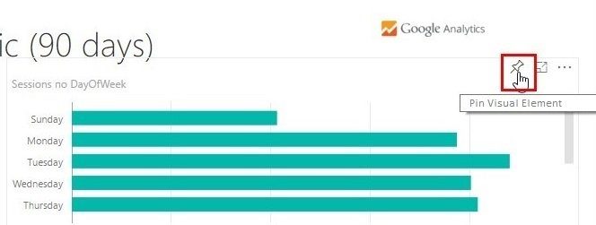
How to create dashboards
You can create new information panels and add any report element by clicking the pin button. Next, you need to choose where you want to place the selected item on an existing or new dashboard. Any dashboard you create can be shared using the “Share” button, located in the upper right corner of the menu of each dashboard you created.
Get help with Power BI
by scheduling a free consultation with FluentPro Team